Showing posts with label study. Show all posts

Thursday, September 22, 2011

B&A: the STUDY - DONE!

Well ... after several weeks of "I am going to post pictures soon" and "this is my weekend goal", I finally have pictures of the updated study. Last, I shared pictures of the new china cabinet and I was waiting to add some final touches before I revealed the rest of the room. If you remember, the study/front porch looked like this when we first moved in:
It was a deep sage green painted over wood paneling. The darker tone made this small study seem even smaller. I really wanted to lighten up the room and update it so I decided on vertical stripes to play off of the existing paneling.
 my first, of a several, coats of white paint
The final stripes with Brandon's "old faithful" desk he found in the trash dumpster. The room looks so lonely, right?! And here is the final room:
I purchased this dark stained, masculine desk at I.O. Metro and it quickly replaced "old faithful." Being able to lift that chunk-er and move it out was the hardest part! The new desk is the perfect size for the wall and adds a heavy piece to anchor the room. 
I found these modern, mint green lamps floating the blog world and I was immediately hooked. I love the geometric shape and variety of colors Robert Abbey offers. I knew this saturated tone (pistachio) would look great with the soft stripes and I thought the trendy style would provide great contrast for Melrose's rustic decor. 
 This is a beautiful picture of two elders in the oldest tribe in Africa, Masai, taken by the talented Eric Chapman (he also shot my bridal portraits that Abode Love featured!) I love the colors, history, and composition in his original photograph.
 butterflies are always cool and trendy ...
 I found this framed doily at a local antique shop in Homewood
 also surrounding - Brandon and I on the honeymoon, my favorite pet, Greta, and a series of crosses I transfered from graves while traveling abroad in Ireland
War Eagle! Brandon and I celebrating our National Championship win in Arizona.
 Here is the reading nook! Can't say I have used it much so far ... but I hope to! I can imagine a cold winter day where I curl up with a good book and a glass of wine ... yes, one day soon. 
 Don't laugh - I know my orange tree is a little shabby right now, but give him a little time and he will flourish (hopefully!).  I was so ecstatic to find this extra large white planter at Target. I wanted something simple, but large enough to make a statement.
I love this vintage inspired moroccan foot stool I found at At Home in Homewood. It has a tad bit of orange in the pattern so I have started echoing that around the study. One thing I love about a saturated color palette is that is allows you to add as much "pops of color" as you would like. 
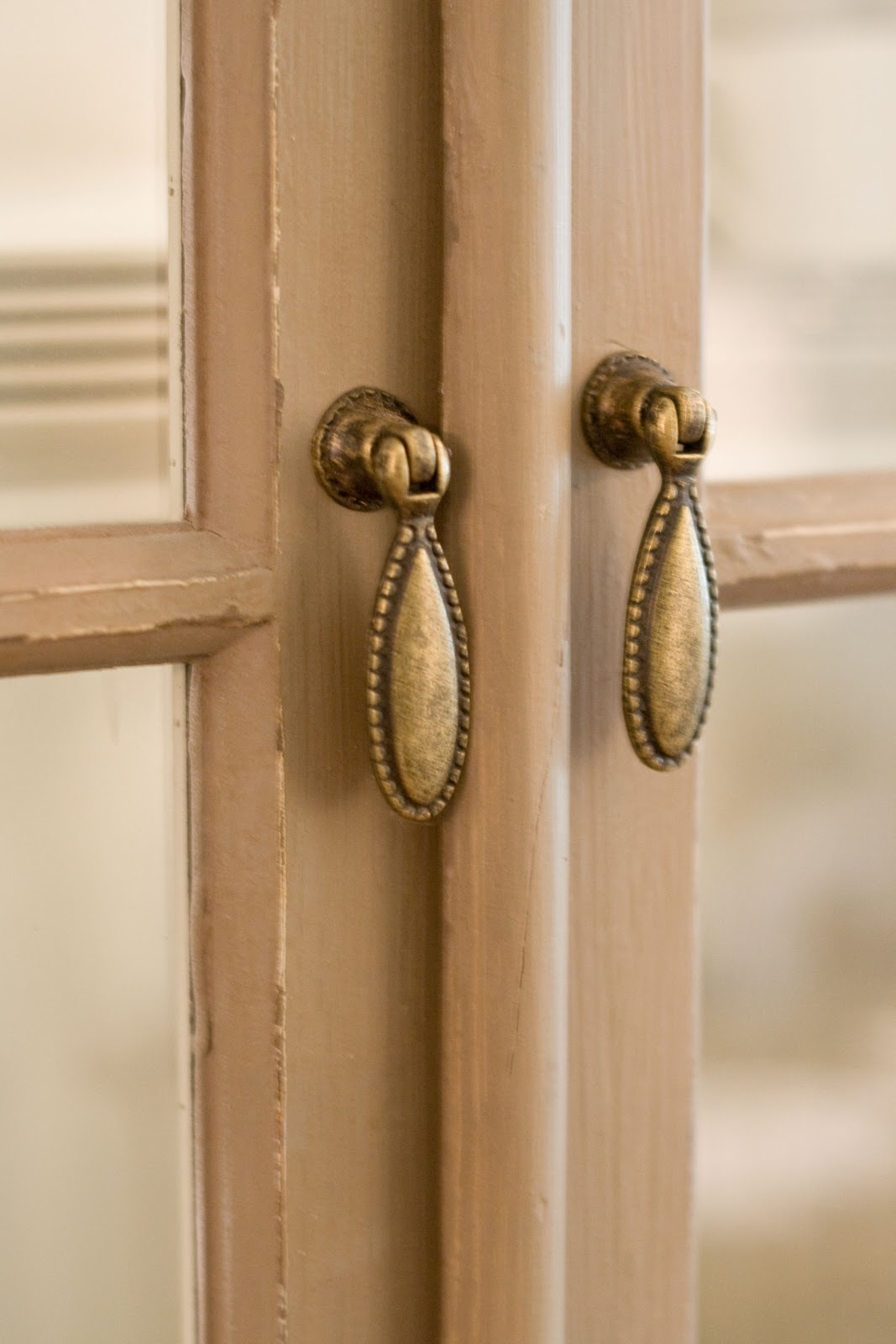
A view of the "reading nook" from the den (through the old window). I ordered this flowers poster from this fabulous Etsy shop that prints large format photographs in half tones. This creates a black and white dot pattern that almost seems vintage. I framed it in a simple poster frame from Target

I decided to bring that orange into the china cabinet as well. I found some beautiful taper candles to place on the giraffes. 
Check out that bowl of rope! Remember my inspiration? After seeing that picture, I decided to use this punch bowl I registered for as a part of my decor while not in use. Can I say resourceful? And space saver?
That's it so far! There is still a few tid bits I would like to add, but I am really happy with how the study has turned out so far. Thanks for tuning in!

Friday, August 26, 2011

STUDY INSPIRATION

So, I am getting super close to revealing the rest of the additions in the striped study and I can't wait. If you remember, I posted pictures of the new china cabinet here but I had a few little adjustments to make before I photographed the entire room. I just have to find the time to take pictures during good daylight. I plan on making this my goal for the weekend! 


In the meantime, I wanted to share a few pictures that inspired the study. If you remember, I painted the once sage green paneling cream and beige stripes and it really brightened up the room. It has one built in shelf that I still don't know what to do with, but I think I have everything else situated! For now ...


I didn't have the rope for my post on the china cabinet, but it will appear in the next
this was a hoot purchasing at our local Lowe's - imagine 2 girls asking for rustic rope to be used as decoration in a glass bowl ... yes ... that is what they thought too

and what is a study without a cozy reading nook? Exactly. This is where Brandon will do all his reading in all his spare time ...

and an arrangement similar to this appears somewhere!

All will be revealed asap! And don't worry, Brandon's frat desk was definitely replaced! Hope everyone has a fabulous weekend and stays cool.

Monday, August 8, 2011

STAY TUNED: update

So ... I know all of you have been dying to know what was in that big box and I believe I am ready to share, partially. My main "decorating" focus lately has been Melrose's striped study. Last I shared about this room, I had transformed this former porch from pea green to chic white and taupe vertical stripes. The lighter tones truly brightened the entire room!


I have lots more to share on this room very soon, but to kill the suspense and misery -- Melrose now has a much needed tall china cabinet. Living in an older home the cabinet space is very sparse and this became a problem when trying to store our newlywed china and stemware. I was on the search for awhile, but I found an amazing deal, and surprisingly, Brandon was even pleased with the price!


Here are some close ups of the new piece. One of my favorite features is the dainty, brass handles. Beautiful, strong hardware can definitely make an impression.
Check out my yellow national geographic magazines (inherited by marriage) -- I love the splash of yellow they add, and paired with my The Help book ... the two pops of color balance each other amongst the whites and creams of my fine china. 


sorry, I know that picture is blurry, but I think it is so fun to see our married monogram on these salad plates
My giraffes need some candles ... and I hope to inset an old rope in the glass punch bowl.  Maybe in my follow up post! And man, how I love my Annie Glass pieces ... that etched gold rim with the soft teal is gorgeous. 
I found the piece at Wisteria while they were running a sale and it arrived four days after placed the order (sorry, it is no longer available). Not having to wait a few months was almost as good as the price! I love how the rustic, gray finish compliments the dining room and the study. Wait 'til you see what else it compliments! Stay tuned ... again!

Monday, July 19, 2010

COVERED BOOKS


[Matt Albiani via Habitually Chic]

I found this awesome picture this morning while skimming my morning blogs and it instantly sparked an idea. I have noticed designers covering books with either brown or white kraft paper (yes, just like in high school when you were required to cover textbooks) to fill bookshelves consistently, but I have not seen both before. I appreciate the uniform look, but I also enjoy variety so this approach really caught my attention. 

Melrose's study has a built in white bookshelf and I have been debating on what to fill it with and I think I may follow this inspiration. I have my "real" books on display in the den. Could this same idea be applied with newspaper as well? Old news, brown kraft, and white matte - good combo?

Here are some more similar images:


These remind me of catalogs - I may have to do this with my Southern Living magazines! [unknown]


I like these use of these crates - either these books are in the same collection or have been wrapped with paper. Either way, I like the consistency. [a life's design]


National Geographic magazines? I love how the yellow pops in a neutral room. [unknown]

I don't read enough to have enough books to cover and fill just yet, but a quick stop by an antique shop or yard sale can fix this!

Tuesday, June 15, 2010

B&A: the STUDY

This room has been "done" for awhile now, but I just haven't taken the time to post after pictures. So...here she is before:

This used to be Melrose's front porch and the previous owners closed it in to create more area. She still has brick floors and paneling on the walls. I think the brick really fits into the rustic theme of the house.

First, Brandon and I primed the walls - it took a few coats to cover up that green! 

Remember my stripe inspiration post? Well, it was put into use here! I wanted to use the white from the den and the beige from the dining room (the 2 rooms splitting the study) and paint 6" vertical stripes. Due to the uneven paneling grooves, I just had to ignore them and measure off the distances myself. This was pretty time consuming but well worth it. 

And here is the final...

[click on all pictures to elarge]

I wanted to point out the patterned texture on the ceiling because I really love it. Some people probably hate it and think it is odd and I not sure the goal of it, but it is so discreet you barely notice it, but when you do it is a nice little surprise. I like that the pattern is simple and conservative, nothing too ornate or floral. I wonder why the previous owners chose to put wallpaper on the ceiling? 

I am still not sure on how I want to decorate or furnish the study, but I am thinking a long bench under the double window and a ladder shelf in the corner between the 2 windows??? I am still trying to collect framed pieces for the collage above the desk. So far, all I have is my Auburn University diploma (Brandon has his hanging in his office). Any suggestions?

Thursday, May 6, 2010

DESKS

Recently, I purchased a desk for "my" office in one of the guest bedrooms. Brandon has his own desk in the study with his computer, filing cabinet, etc. But, don't be fooled, his ever-so-beautiful [laminate] wooden desk that he COULD NOT part with was found outside the Sigma Nu house because it was going to be thrown away. (side note: I did not discover this secret until Brandon was bragging on it to his Uncle about 2 months ago! The whole time I basically thought this was a family heirloom from his childhood!) . I think Brandon asked himself, "How could anyone throw this beauty away? This is a gem!" and since then she has made her way from Auburn to Montgomery, to now Birmingham where she rests. Hopefully she will R.I.P. oneday! ;)

The room is painted a mauve gray and I want to accent the room with lots of golds and white so I wanted something simple and not too harsh. I collected desk images of designer's and blogger's work areas to inspire me. Oh the day when I can work at my desk all day and blog and design as I desire. Until then, here are some of my favorites:


[unknown]


[nate burkus' desk via cote de teaxs]

Obviously, I am attracted to the sawhorse desk and that is the direction I decided to go in. I ordered this desk from West Elm:


I love the sleek black frame and the glass top, plus it fit the designated wall perfectly. Now, I just need a chair. Any suggestions? I am looking for a white fabric tufted chair. Until then, I am temporarily using 1 of the 2 dining chairs we have. 

I have also been collecting images of offices in general and focusing on the storage supplies, arrangements, inspiration boards, filing cabinets, etc. and will share those in a future post. I have basically set up my office and will post pictures asap. 

Tuesday, April 6, 2010

STRIPES GALORE!

I have been painting the study (which used to be the front porch until somebody closed it in) for about the past two weeks and I have finally made progress! It was an olive-ish green, but it will soon be white with "grant beige" vertical stripes. The walls have paneling and I debated about just following the panel grooves, but I found that they are not even widths. Me being a perfectionist, I knew this inconsistency would bother me so I decided to ignore the panels and draw my own 6" stripes. 

I have been collecting inspiration images of rooms with stripes for a while now and I wanted to share a few of my favorites. Of course, I like the neutral colors the best, but bold colors can always be fun. And, for some reason I am always drawn to the narrow stripes. I like big, fat wide horizontal stripes for hallways or long walls.


My "main" inspiration for the study. [unknown]


[unknown]


I think I will eventually do the hallway to the master bedroom something something similar to this. [unknown]


[unknown]


[unknown]


Love the stripes on the worn floor. [unknown]

And, here is a sneak peek of my own stripes. I think it is going to turn out great, and Brandon said he is very impressed with my straight lines! More pics to come!


Again, sorry for the poor resolution and bad lighting - the picture is from my iphone.